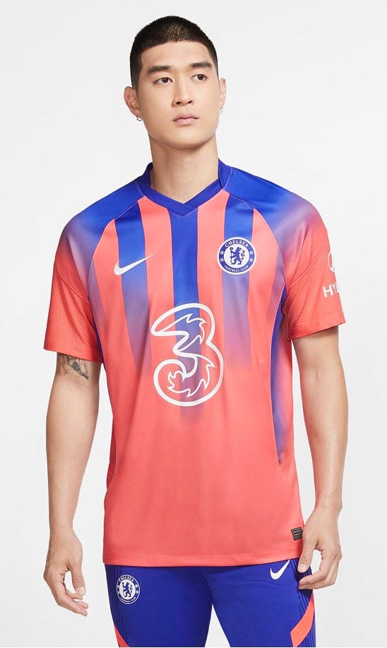
Trash Compactor: 2020 Chelsea Third Kit
We've talked about the sponsor logo. Now let's talk about this fresh new atrocity.
I know I’ve made fun of Chelsea a lot. I already had an entire Trash Compactor dedicated to them, and the 3 logo adorning the front of their kits for next season. Talking about their light blue kit, I used the phrase “the Odd Future/Chance the Rapper collaboration no one wanted,” a joke I am still very proud of. The kits I made fun of in that newsletter, however, are fine kits. I’d even say the light blue secondary kit is good and interesting. It’t the corporate logo that brings them down. On their own, they’re solid, if not incredibly interesting design-wise.
What I’m saying is, buckle up, kiddos, because the Chelsea third kit is here and it looks like someone said “Crystal Palace, if it was a melting ice cream cone.”
I’m not even going to talk about the sponsor logo here. My feelings on the subject are very well-spelled out. And furthermore, I don’t need to talk about the sponsor logo to make this a worthwhile trash compactor. In a year where big Premier League clubs like Manchester City, Manchester United, and Arsenal have decided to go a far afield on at least one kit design they’ll be wearing this season, Chelsea’s third takes the case in its badness. This kit is putrid. Let’s talk about it.
The first thing we need to address is the color. Seriously, what color is that? Salmon? Coral? Chelsea became suddenly and surprisingly likable last season in no small part thanks to a transfer ban that forced the team, finally, to play a bunch of their academy products, who just so happened to be young, good, and most importantly, pretty cool. Now that the transfer ban is gone and Chelsea has bought over 150 million euros worth (and counting!) of player redundancies, they can bury all the cool kids on the bench and on loan again, and trot out a team wearing these, a kit akin to wearing salmon pants and Sperrys. Mason Mount will look like he’s going to a Chainsmokers concert in the Hamptons in one of these. If I had to best describe the color, I’d say it’s Off-Red. It’s the color that things are dyed when they have artificial peach flavoring in them.
The color, I think, is not good, but it’s especially not good when paired with the bright royal blue. Yes, the blue is very Chelsea. That doesn’t make it a neutral. A lot of the time, when you pick these bold, out there choices in color or design, you see either softer colors, or more black and/or white. City’s paisley kits? Crazy design, went with softer colors on a white background. Arsenal’s vampire thing? A bolder color, but put on a white background, and even made the crest black and white. The Peach and Blue combo here just pulls me in several different directions, and all of them lead to a dumpster.
Then we have the stripes, which have been erased in a way that suggest a rudimentary knowledge of Microsoft Paint. I don’t know why people feel the need to mess around with stripes? Stripes are a good design in and of themselves! The stripes, however, don’t really get to me all that much. If they went all the way down the kit, I’d still probably feel the same about them. What does make me laugh, however, is the return of the ab stripe. You remember the ab stripe? Soccer kits used to be obsessed with the ab stripe in the 2000s.
You’

You’d see all these kits with little stripes and shading details along the sides of the kit, presumably to accentuate a player’s abs? I don’t know, I’ve always thought that trend in design was a little strange. But they are back in full force on these kits, and let me tell you what, these Chelsea players are about to look SVELTE.
I know that I seem to move the goalposts a lot in what I deem to be “good” and “bad” kit design, and the tension between not being boring and putting out something that’s just garish and little else is a difficult one to navigate. Rarely does a kit come along, however, that I can’t even applaud the effort that went into making it. There’s fifteen different ideas going into this kit, and Nike said “YES” to all of them, when they needed to cut it down to three.
Um


I think it goes without saying that comparing wearing a mask to carrying out the Holocaust is at absolute best in the worst taste possible, and beyond that is, well, ground for dismissal in most cases, I’d imagine. Too bad Le Tissier already lost his job.
Giveaway Time!
The podcast that bears the same name and branding as this newsletter is doing a giveaway. You like free stuff? Cool. All you need to do is follow @DeadBallPod on Twitter and retweet this tweet.

That’s it! That’s all you need to do! Go!


